
Figma
Adobe XD
Canva
Microsoft Suite
InVision
Sketch
Figma Adobe XD Canva Microsoft Suite InVision Sketch
Case Study
Breezy
A group travel app that simplifies trip planning by managing bookings, itineraries, collaboration, payment splitting, and event organization all in one platform.
Role: UX/UI designer
Industry: Travel & trip planning
Duration: 3 week sprint

The Challenge
Coordinating group trips is often fragmented and inefficient, hindered by scattered tools, poor communication, and an overload of choices.
The Solution
An integrated app that simplifies group travel and communication - from booking transportation & lodging to handling payments and sharing itineraries all in one place.


Jump to…


With our core features outlined, we mapped a user journey to ensure they addressed the identified pain points.
The Result:
Breezy’s prioritized features are on track to streamline trip planning and and alleviate common pain points such as choice overload, coordination stress, and budget uncertainty
Research
Firing that first shot
What kinds of problems do users have when planning a group trip?
How does it make them feel?
How would our theorized travel app align with the conceptualized user?
What problems would Breezy need to address?
Speaking one-on-one with trip takers revealed how overwhelming the trip planning process was — especially when planning for groups.
Some key concerns included…
Budgeting
Deal finding
Collaborating with trip members
Safety
Ensuring preferences were met
User Insights Assessment
User discussions shaped the development of a persona, highlighting key pain points for Breezy to address. From this, we identified three core solution areas:

?
?
?
Solution Mapping

Option Limitation — Reducing choice overload to improve decision-making.
Financial Assistance — Emphasizing cost transparency and deals.
Communication Aids — Enhancing coordination among travelers to prevent disorganized plans and user overwhelm.
With our three core solution areas in mind, we began brainstorming specific features…
Breezy will include…
The option to follow step-by-step trip planning guidance for users who are not sure where to begin.
An in-app calendar to track trip events and coordinate group outings.
An in-app “wallet” to store all tickets and reservations for the trip (flights, hotels, activities, etc.).
The ability to split payments and track expenses with a travel group.
Foundation Checks
User Insights Collection

Tools & Methods
-
To develop an idea of the typical user.
-
Using gathered feedback to identify any common pain points in the travel planning process.
-
To capture users’ emotional responses to planning flexible group trips.
-
To kick off the ideation phase and turn our minds to potential app features.
-
To begin prioritizing the features to include in Breezy based on user’s main stressors.
-
To visualize how a user may be served by the theorized features and to check for any concept weaknesses.


Style Creation
“Blue is seen as a sign of stability and reliability”
-Kendra Cherry, MSEd on VeryWellMind.com
Fonts with distinct lines, open apertures, and low contrast are more readable
-Kendra Cherry, MSEd on VeryWellMind.com

How can we effectively translate our core features into a functional app?
How do other apps approach trip planning? What are the industry standards?
What design choices will align our core features with industry standards to create a simple and engaging user experience?
Tools & Methods
-
To establish industry standards and give us design inspiration within our own app.
-
To outline Breezy’s essential screens.
-
To create the core feel and mood of our app - intended to work in tandem with our foundational flows.
Competitor Analysis
Ideation
Competitive market analysis played a key role in shaping Breezy, guiding our user flows and inspiring our core design.
We analyzed top competitors, selecting key screens to inform Breezy’s initial layout.
Foundation Building
The Bach Wanderlog Troupe Trip Pilot Grotu Tripline
After analyzing travel apps, we created a user flow to structure core features and guide wireframe design.
Given the complexity of trip planning and users’ initial overwhelm at the onset of trip planning,
we prioritized the app’s opening flow.
User Flow
Splash Screen
(Swipe through coaching screens — 1st time only)
Login screen
(Log-in with credentials)
App home screen
(Click on “+” to start a trip)
Planning option overview screen
(Click on “Destination”)
Destination page with interactive map
(Type in “New York”)
Date/Time page with interactive calendar
(Adjust date range on calendar)
Customize trip folder page
(Add title, pictures, etc.)
Travel group creation page
(Add from phone’s contacts or share a link)
Enable notifications for updates, polls, expenses, etc.
(Select “Enable”)
Success!
(Now Lydia and her group are ready to start looking for accommodations, activities, and restaurants!)
Driving design choices:
The Name:
We chose the name “Breezy” to evoke a sense of ease and adventure in users.
Color Palette:
We opted for cool-toned blues, a choice driven by the color’s association with trust and reliability.
Font
The Lexend font was chosen because it is a very open, sans serif font known to assist in readability and keeping interfaces simple.
Shooting the second arrow
?
?
?
Destination
These screens were used for user testing instead of high-fidelity wireframes since the more basic screen designs allowed us to evaluate the app's functionality and structure separately from aesthetic design distractions.

Login


Trip Home
How should we apply the user flow and style guide to a low-fidelity design?
Low Fidelity Structure Testing
Date
Home


Edit Trip
Wireframing
Shooting the third arrow
?
?
?
Tools & Methods
-
To establish the foundation of Breezy to be later iterated into a high fidelity design.
User Testing
Observed Issues
Login Screen The layout was confusing — the sign-up was not clearly denoted.
Destination Screen: The word “Location” did not convey the correct action — it implied where you already are.
Home Screen: Nothing to indicate that the screen was the home screen. The “+” icons also did not look clickable.
Customization Screen: Unclear whether or not the trip has been created at this point.
Tags Screen: Tags as a separate step and not connected to trip customization was misleading.

What aspects of our app design confuse users?
Which design elements resonate well with users, and should they be applied more consistently?
Are user challenges rooted in the app’s flow, page structure, or both?
Testing
Almost there, loose the fourth arrow!
?
?
?
Tools & Methods
-
To pinpoint any design flaws and lingering points of user frustration.


High Fidelity Iterations
After analyzing the feedback from user testing we corrected our low fidelity models accordingly and created high fidelity wireframes based on those corrected iterations.
Home Screen:
Added shadows to clearly signal CTAs.
Switched to all “+” icons for consistency.
Added a “Home” option to the bottom navigation to more clearly denote what page user was on.
Altered layout of the “Trips” section to eliminate need for a secondary screen.
Trip Folder Screen:
Changed how the sections were separated to allow for a more modern (and fun) flow
Indicated Breezy Buddy status of members in the travel party
More clearly indicated clickable buttons on the “+” icons with boxes and drop shadows
Added more sections to allow for an all-inclusive planning experience
The iterations on the original design and subsequent translation into high-fidelity designs proved successful in improving user comprehension of the app and significantly contributed to an improvement in the group trip planning process.
Note: We developed the high fidelity wireframes after the completion of the low fidelity testing phase and incorporated the design updates as we went.
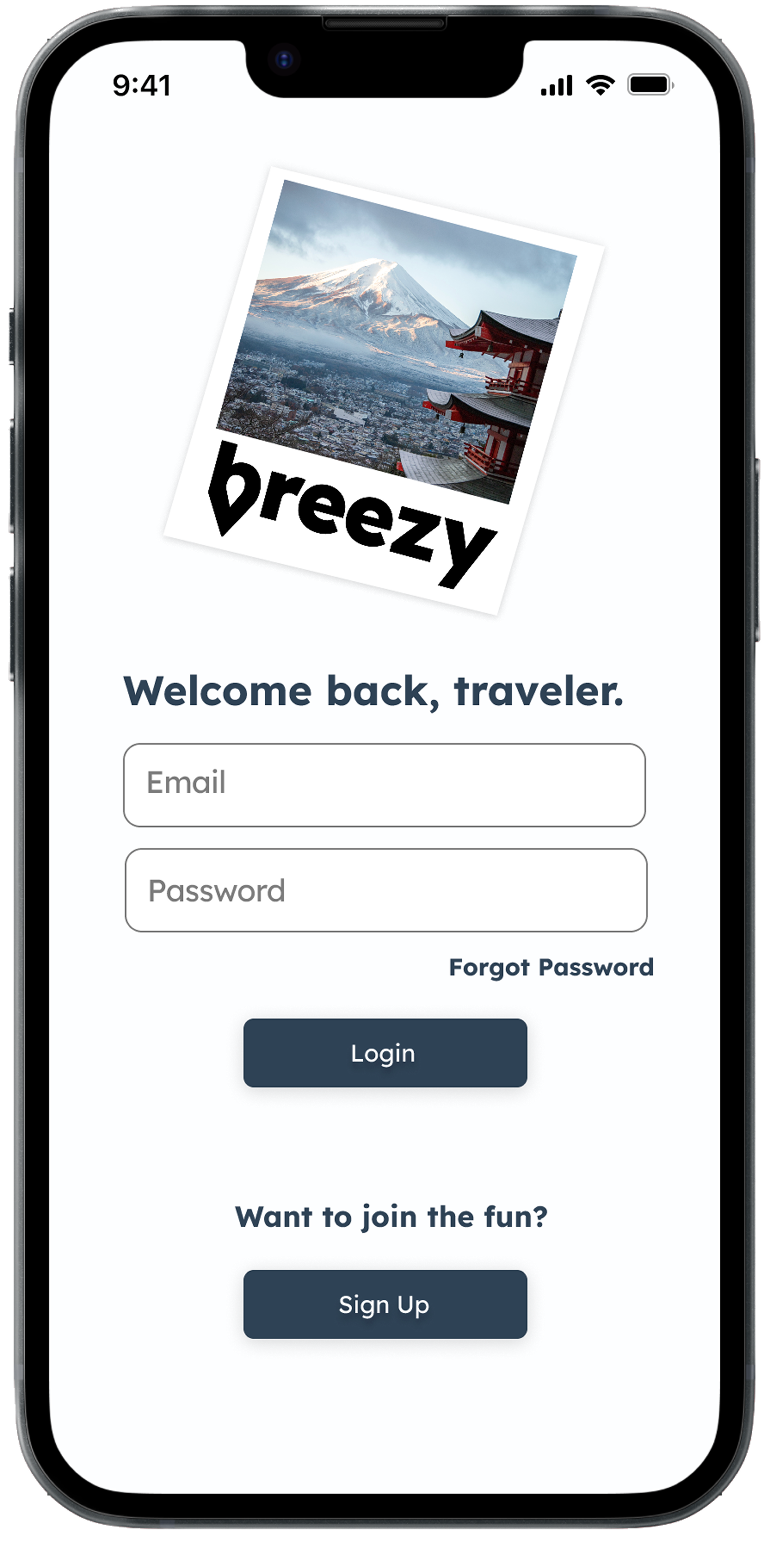


Login Screen:
Switched from a default “Sign-Up” screen to a default “Login” screen.
Eliminated coaching screens above the login.
Added more clearly denoted CTA buttons.
Added a tag line to enhance the mood of the login.

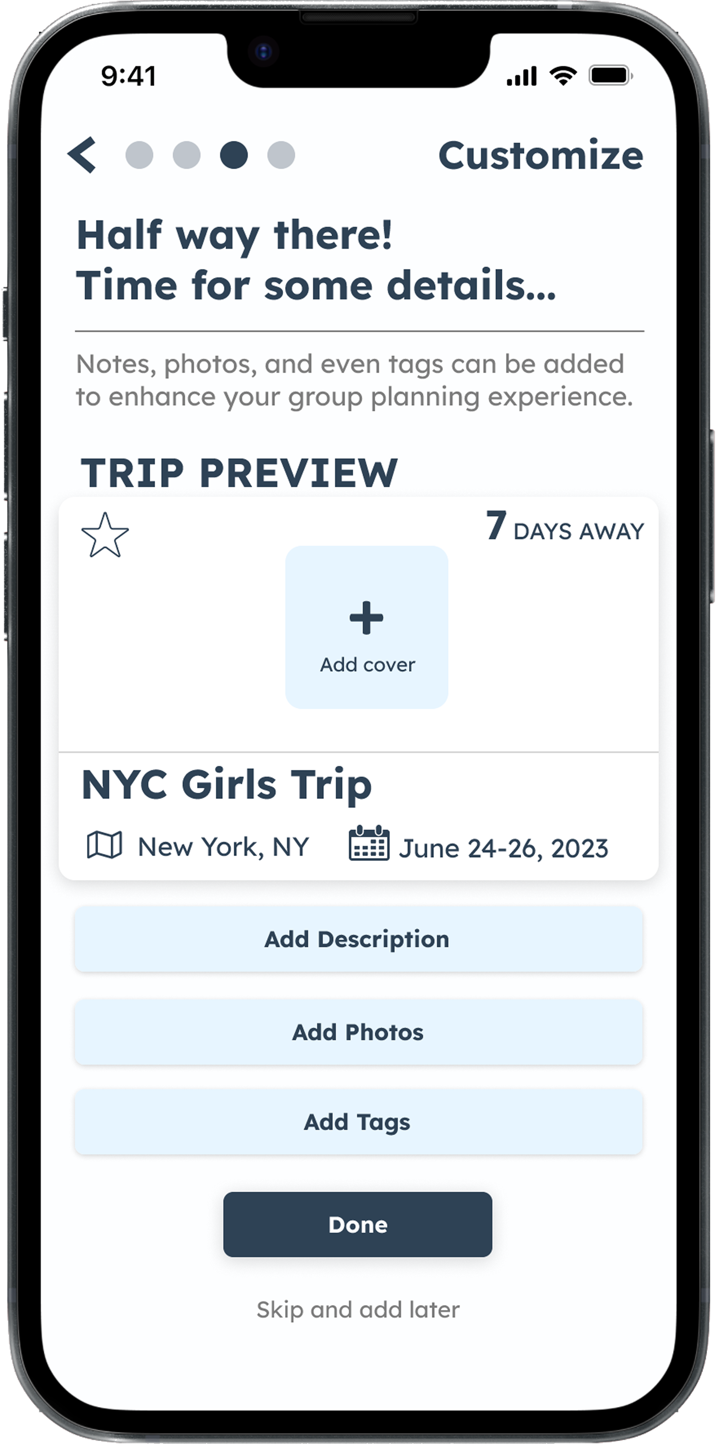
Customization Screen:
Pulled “Tags” step out of overall trip creation (now only 4 steps) and added it in place of “Polls” to the trip customization options.
Simplified the trip creation’s progress navigation and added a page indication label to more clearly communicate to the user where they are in the trip creation process.
Added a “Done” button so user could move on from page at any time.

What updates to the low-fidelity screens would improve user comprehension?
How effective are our proposed solutions?
How should the style guide be applied to high-fidelity wireframes, and how can elements and colors be used for clear visual communication?
Iterating
Loosing the fifth arrow (Bullseye!)
?
?
?
Tools & Methods
-
To see how our finalized designs and structure all come together.
Lessons from Breezy
Breezy highlights the importance of continuity, clarity, and organization. With modern apps packing extensive functionality into limited space, a well-structured format is essential to keep users engaged and prevent confusion—ensuring long-term usability and retention.
Looking to the Future…
with Breezy
Adding a polling feature to Breezy would allow users to suggest and vote on activities and transportation, keeping the planning process collaborative and engaging.
🗳️ Polling
Deals and discounts were a top priority for Breezy users. A rewards system that is partnered with a credit card company, offering perks for purchases, would encourage long-term use of the app.
💳 Credit Card Partnerships
A trip randomizer feature based on user-defined parameters would maintain interest in Breezy and reintroduce excitement if the app ever grew stagnant.
🎲 Trip Randomization
I’d love to chat with you!
Thank you so much for checking out my page!
If you are interested in collaborating, want to know more about my design process, or simply just want to chat, please don’t hesitate to reach out!