
Figma
Adobe XD
Canva
Microsoft Suite
InVision
Figma Adobe XD Canva Microsoft Suite InVision

Project
Point Blank Simulator
An immersive home-based tactical shooting simulator designed for comprehensive weapons training.
Role: Product Designer
Industry: Virtual Reality
Duration: 6 mo.


The Challenge
The Point Blank Simulator is returning with cutting-edge tech, but its outdated design fails to garner new users and convey the sim’s potential, causing shooting enthusiasts to overlook its true value as a serious training tool.
The Solution
Point Blank simulator needs a more modern and engaging design that is visually compelling enough to get users “in the door”. Once users interact with its capabilities, the simulator’s true training potential shines through.
Jump to…
Research

Ideation

Wireframing

NOTE: All content related to the Point Blank Simulator is the sole property of Point Blank Simulator UK, protected by copyright. Any endeavor to disseminate these materials beyond alotted purposes is subject to legal consequences.
© Point Blank Simulator UK
Firing the first shot
Research
?
?
?
How does the BETA layout function?
What opportunities for improvement are there in the existing design? Can these address gaps in the simulator market?
What do people typically value in a simulator? How can these features be incorporated/emphasized in Point Blank’s design?
Simulator Assessment
I joined the project at a stage where the simulator already had a basic layout and brand direction, requiring me to both honor the existing framework and enhance it.
Because design and development progressed in parallel, my work moved fluidly across three phases:
Research – Continuously analyzing the evolving simulator and its audience.
Ideation – Developing strategies to integrate new sequences into a cohesive design.
Wireframing – Creating and refining sequences to build an expanding repository of screens for developers to pull from.

Numeric Site Map
To quickly onboard, I mapped the simulator’s structure with a site map, identifying gaps and opportunities for improvement.

Visual Site Map
To support the simulator’s laser-based navigation, I created a visual site map where colored lines trace each “shot” to the next screen. Most content was placed within a 3-click flow to ensure easy access—even for users with less precise aim.
In this initial evaluation, I flagged 2 structural deficiencies to work on throughout the redesign…
1. Primary Menus
Main menu (L1)

Drills menu (L2)
❗️ There are too few CTA options for all the desired future features and a generally outdated appearance.

❗️Menus do not properly signal progression in content type — the user’s position in the menu flow is unclear.
Field Research
Alongside site map development, I conducted online research to explore perceptions of home-based shooting simulators. Insights were drawn primarily from social platforms and discussion forums where enthusiasts shared experiences, including:
Reddit
Youtube
FFGRID


Key research findings:
👎 Negative…
Training Effectiveness: Skepticism about how closely simulators replicate real shooting.
Safety Preparedness: Concerns that home setups don’t adequately teach firearm safety.
Cost and Accessibility: Frustration with high prices and long setups, especially as higher accuracy drives up cost.
👍 Positive
Skill Improvement: Many professionals see simulators as the future of training, citing their value during COVID-19 when ranges were closed.
“several studies showed the importance of emotional aspects as drivers of market success…”
“embedding emotional stimuli (e.g. such as…vibrant colors) into interfaces elicited positive emotions in learners and improved learning outcomes.”
Chirico et al. in Developing Emotional Design: Emotions as Cognitive Processes and their Role in the Design of Interactive Technologies
2. Secondary Menus
“emotions are considered the mechanisms that signal when events are favorable or harmful to one’s concerns”
Desmet et al. in Emotional Design; Application of a Research-Based Design Approach
Academic Research
After exploring social media, I aimed to understand how design styles influence product perception.
Point Blank’s brand balances these 2 aspects:
The seriousness of real-life skills training
The excitement of familiar first-person shooting games.
My academic research sought to identify the design elements that would enhance these two key aspects of the brand.
Research showed that positive emotions enhance real-world comprehension. As designers, we can leverage this by evoking familiarity and excitement from FPS games. Creating these positive associations helps users view the simulator as both engaging and effective—reinforcing real-life skill development.
Persona Building
With a clear understanding of Point Blank and its goals for attracting the target user, a user persona was created to provide a tangible reference throughout the ideation and design process of the simulator.

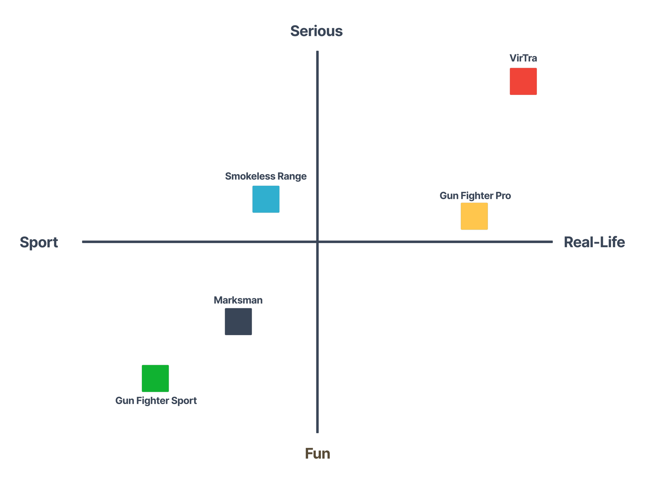
Competitor Analysis
The final step was evaluating digital shooting simulators on the market. This emerging field is split between:
Realistic training simulators
Sport-like entertainment simulators
Point Blank bridges both, combining serious training (e.g., military qualifiers) with fun programs (e.g., zombie shooters, sport hunting) to occupy a unique niche..
VirTra Smokeless Range Gun Fighter Pro Marksman Marksman
Tools & Methods
-
To create an idea of the existing simulator structure and identify any gaps or potential improvement areas.
-
To understand what a user looks for in a shooting simulator and identify possible design points.
-
To establish industry standards, identify market gaps and provide design inspiration for Point Blank.
-
To visualize how a user’s shooting goals would translate into simulator features.
-
To conceptualize our standard user and anticipate pain points either in the existing or future design.
Firing the second arrow
Ideation
?
?
?
What color themes and styles will balance the simulator's serious tone with its occasional game-like feel?
What emotions do these styles evoke, and how will they enhance the simulator's atmosphere and skill-building experience?
How can these styles and color choices improve screen organization and navigation?
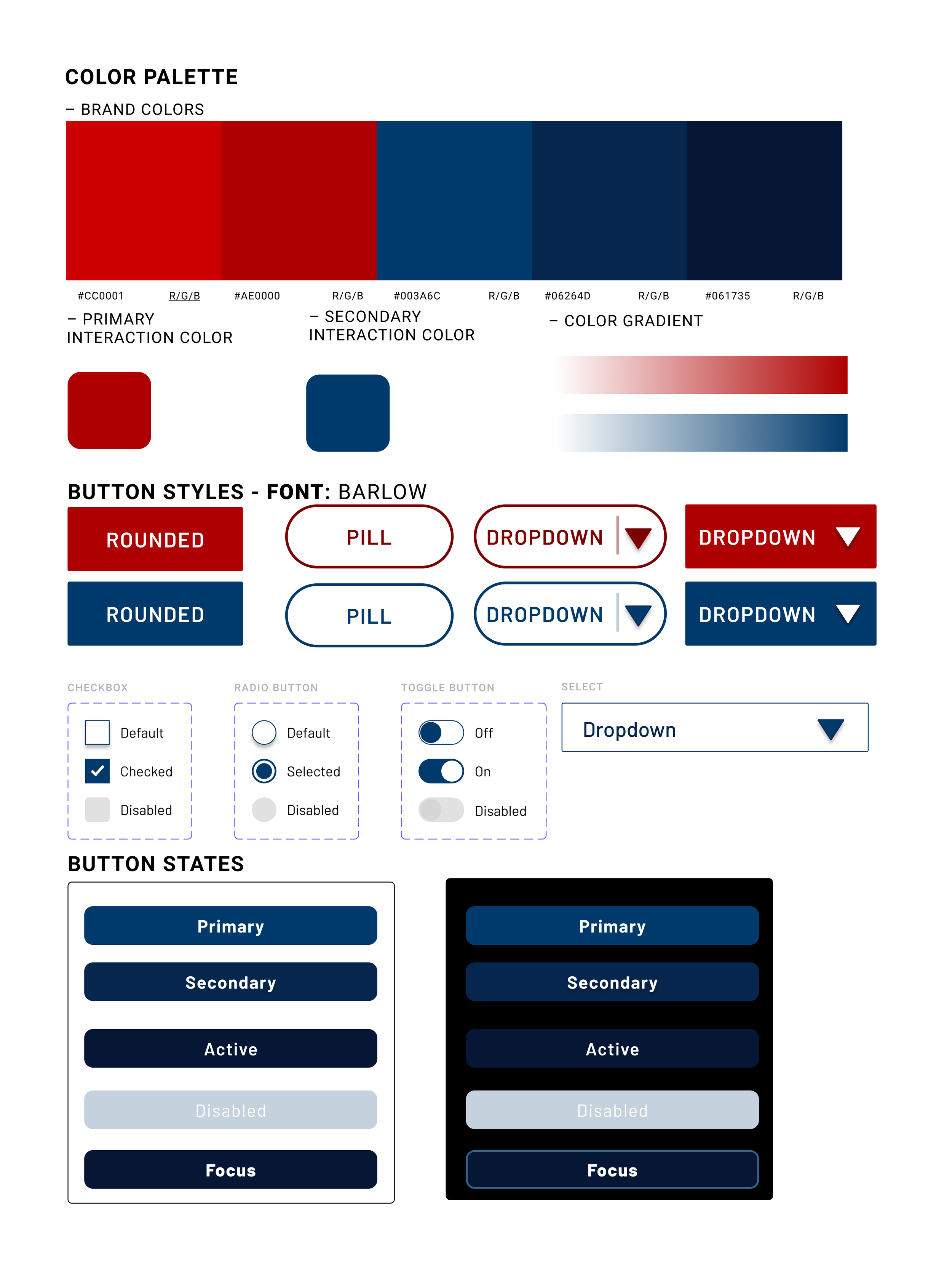
Style Creation
The style guide features a monochromatic color scheme, emphasizing the contrast between red, which evokes excitement and passion, and black, which enhances immersion. Buttons, typography, and iconography were designed with a video game-inspired aesthetic to reinforce the simulator's dynamic and engaging feel.

Collaboration Mode Menu
Supplementary Colors
With the style set, I redesigned the layout to improve navigation while keeping the core structure. An annotated mind map captured new features and potential upgrades.

Diamond Key
Dark — 1 “click”
Mid-tone — 2 “clicks”
Light — 3 “clicks”
Another large challenge was designing for the simulator’s unique laser-based input, which is essentially a laser placed into a gun cartridge that is “fired” at the screen for selection. While some users may have a stream deck, most rely on aiming at the screen. To support less-accurate shooters, the layout minimizes clicks needed to reach training.
Tools & Methods
-
To construct the core feel and mood of the simulator.
-
To organize the screens and establish style application patterns.
Shooting the third arrow
Wireframing
?
?
?
How are the simulators screens appearing after combining the updates to style and structure?
Do they address user pain points and create the desired feel?
High-Fidelity Designs
As screens were finalized, they were placed into the mapped structure and styled according to the guide. This created a streamlined and consistent system that honored the original simulator while improving layout and design.
Key implementations included:
A predominantly sharp-edged, rectangular design to reinforce the simulator's focus on training and seriousness.
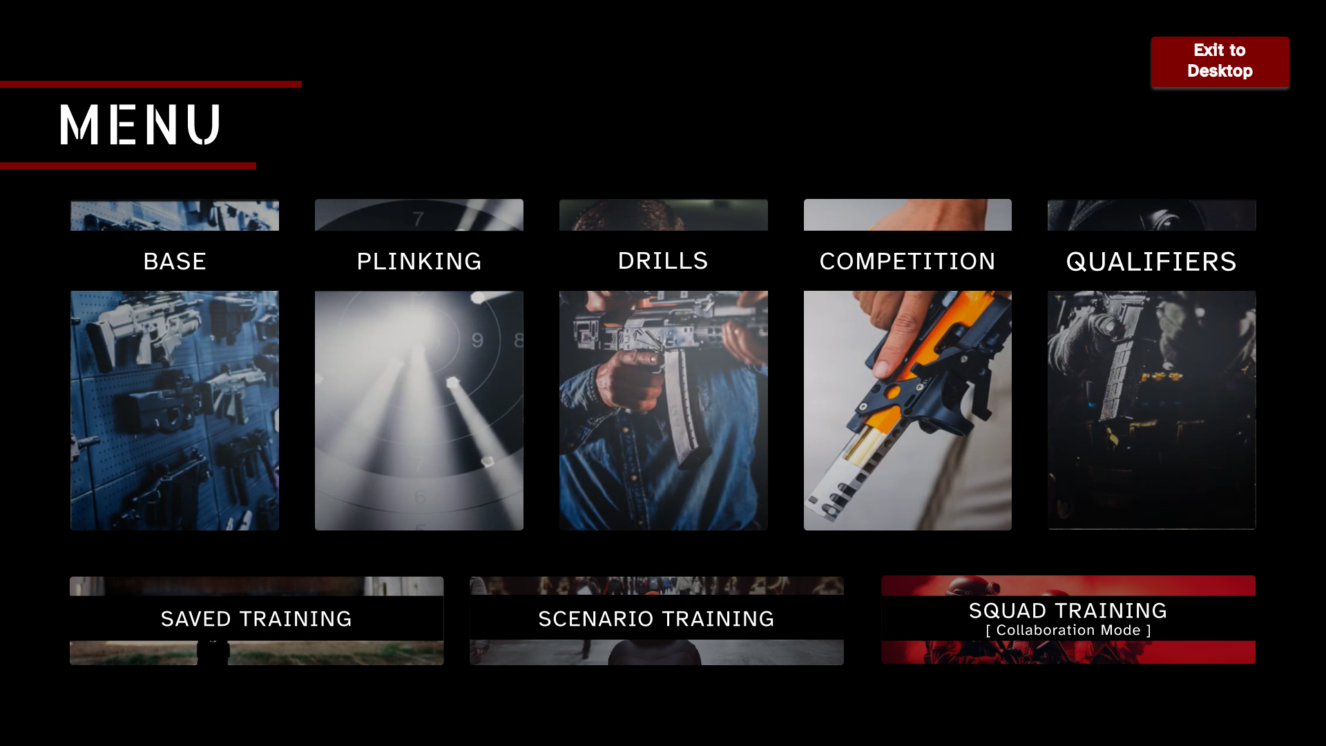
IMPROVED Main Menu
Brighter and more alerting shades of red to call attention to more commonly-used CTAs on each screen, while darker and more muted shades were used to keep the overall feel of each screen immersive.

NEW Collaboration Mode (Multiplayer)
A standardized dual-area layout. This design divided the interface into two primary interaction areas on all non-global nav screens in order to enhance consistency across the SIM while remaining adaptable to both the standard laser input and the optional stream deck that some users had.
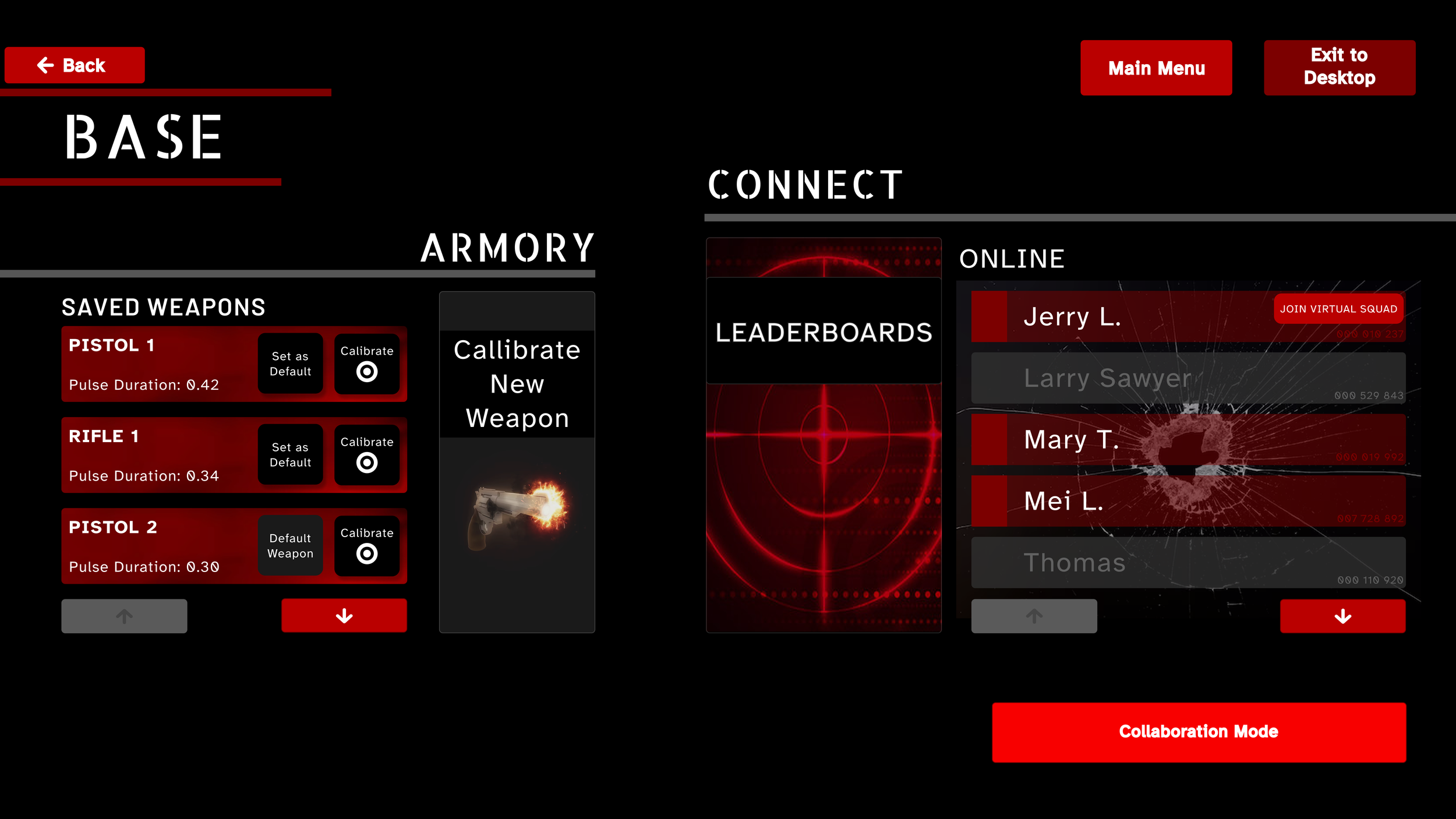
NEW Base Menu
Vibrant images and fonts reminiscent of typical shooting games to enhance user engagement and create a sense of familiarity with the interface.
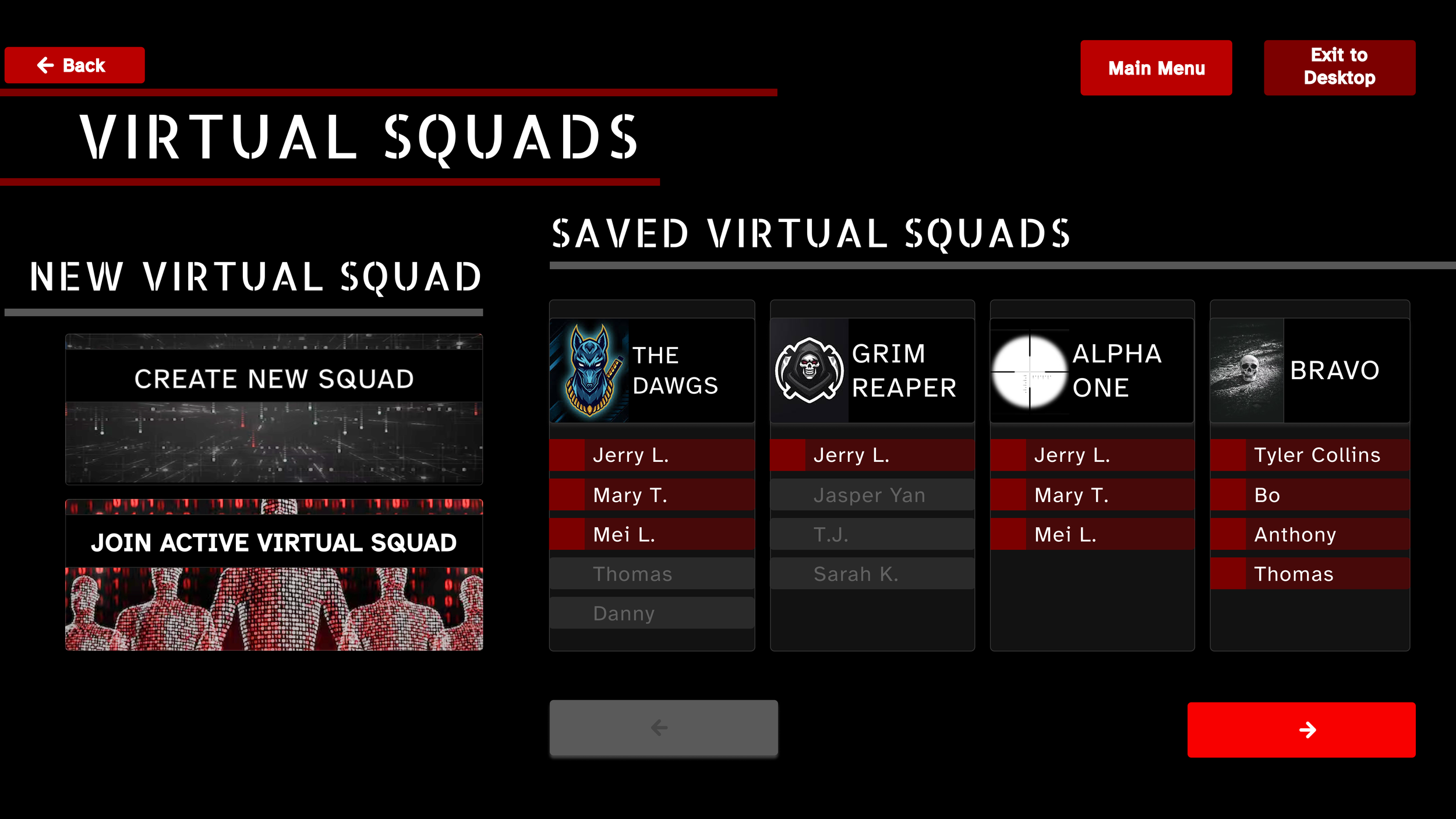
NEW Virtual Squad Menu
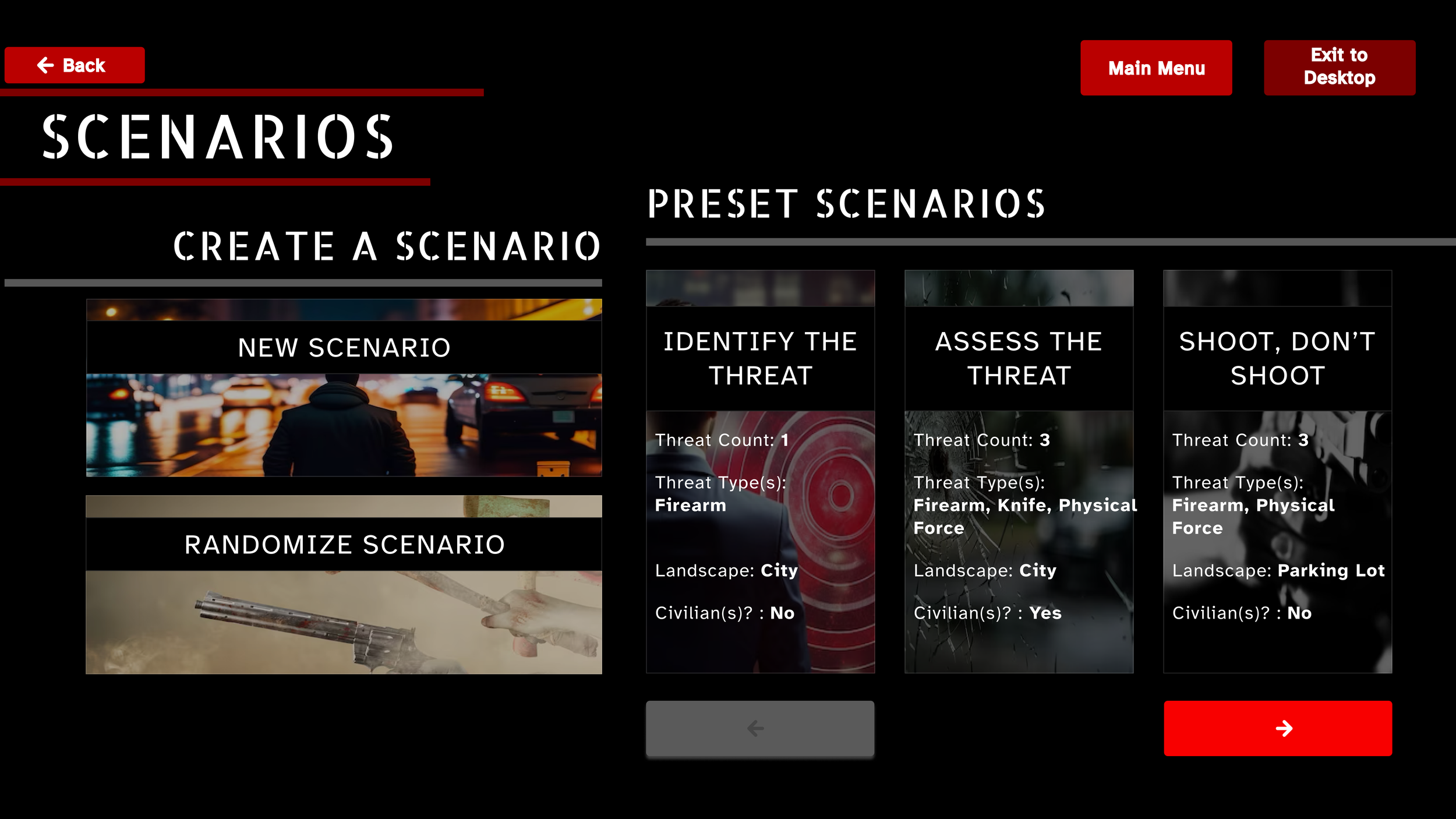
NEW Scenario Training Menu

IMPROVED Drill Selection Menu
🔄
These three design phases formed a continuous cycle in Point Blank’s development—conceptualizing and building simulator flows and screens until user testing was approved and the next stage could begin.
Tools & Methods
-
To see how our finalized designs and structure all come together.
I’d love to chat with you!
Thank you so much for checking out my page!
If you are interested in collaborating, want to know more about my design process, or simply just want to chat, please don’t hesitate to reach out!